Late April last year, Uros and I arrived home, after months of traveling. During the long days on the road we spent dreaming and talking about how we would want to one day revamp our site and why. We’ll write more about the why in the next week’s article and more about how in today’s.
Coming home, our dream became quite solidified in our minds. We had no idea how it would happen, but we kept the conversations rolling. We talked about how we would want it to look so often that I was able to scroll the entire site in my mind.
We started keeping an eye out, searching websites for the best theme we’d been dreaming of. We searched and searched but nothing was exactly what we were looking for. We worried and were filled with loads of self-doubt on how we’re going to do it, as none of us had any site building skills whatsoever, but somehow we knew it HAD to happen.
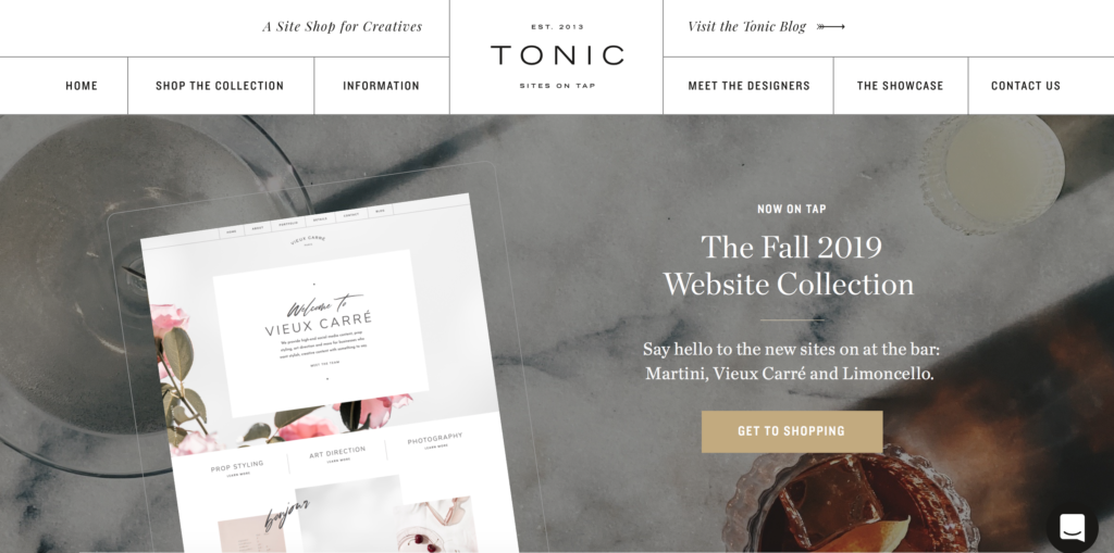
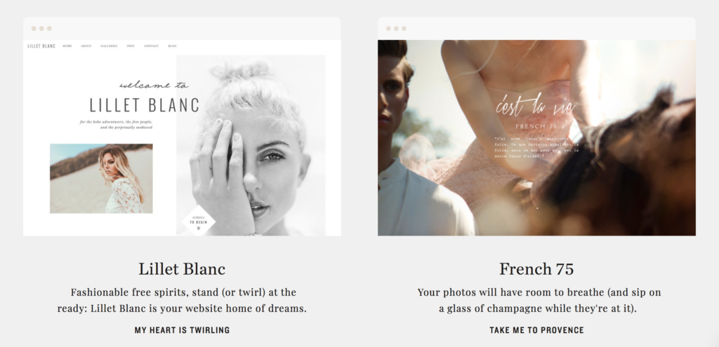
So, in late summer the dream really expanded when we came across the team at TONIC. We were were immediately impressed by their stunning work, and also about having the ability of a full control over our own blog’s design and layout through their fully customizable templates.
In the hope that TONIC will bring our dreams to life we hopped on a call with Jeff. Him and Jen both brought some amazing ideas to the table and we really felt this was going in the right direction. It was everything we’ve envisioned and from there the site evolved pretty fast.
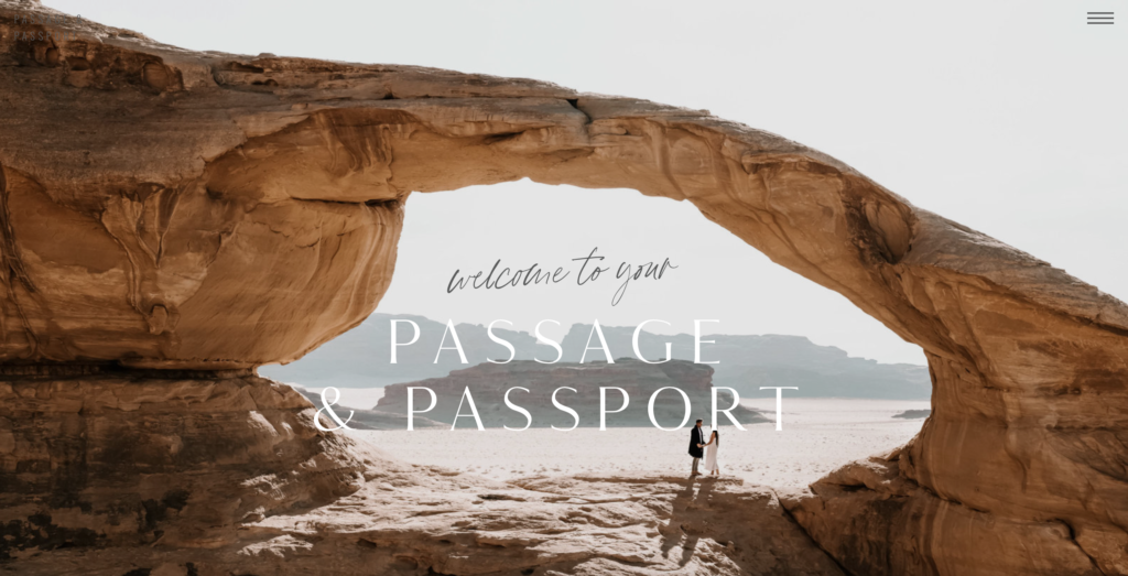
So here we are! We’re pretty over the moon with the result. We LOVE our site now. We’re so grateful for Jen’s and Jeff’s talent that helped us bring our vibe and aesthetic to life. And now we can also do something we never imagined we’d be capable of – customise and maintain our site ourselves in a way we want it with easy drag-and-drop builders, without needing the coding skills or emailing a developer.
And now to our brand new site tour … We’re sure by now you’ve had a chance to have a peek, but below is a quick tour for easier navigation. If there’s anything we forgot to mention and you’d love to know please reach out or comment below!
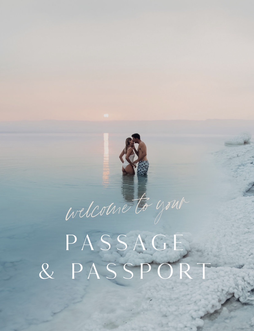
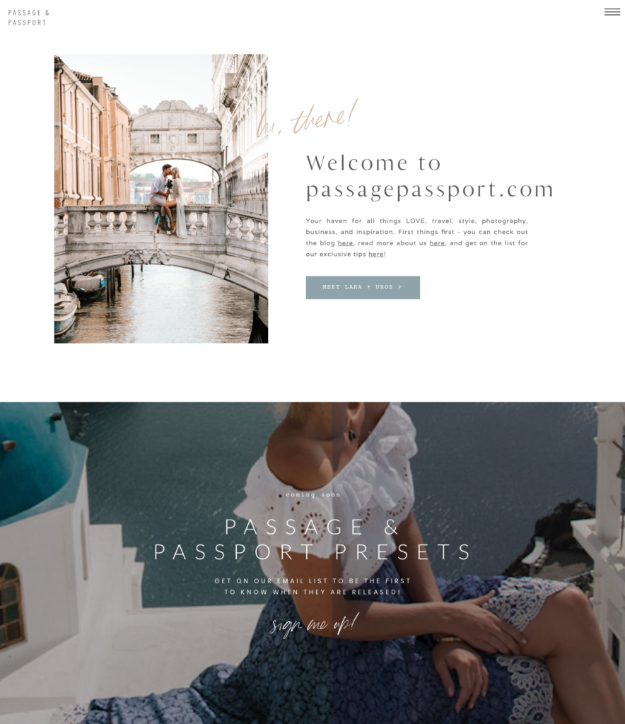
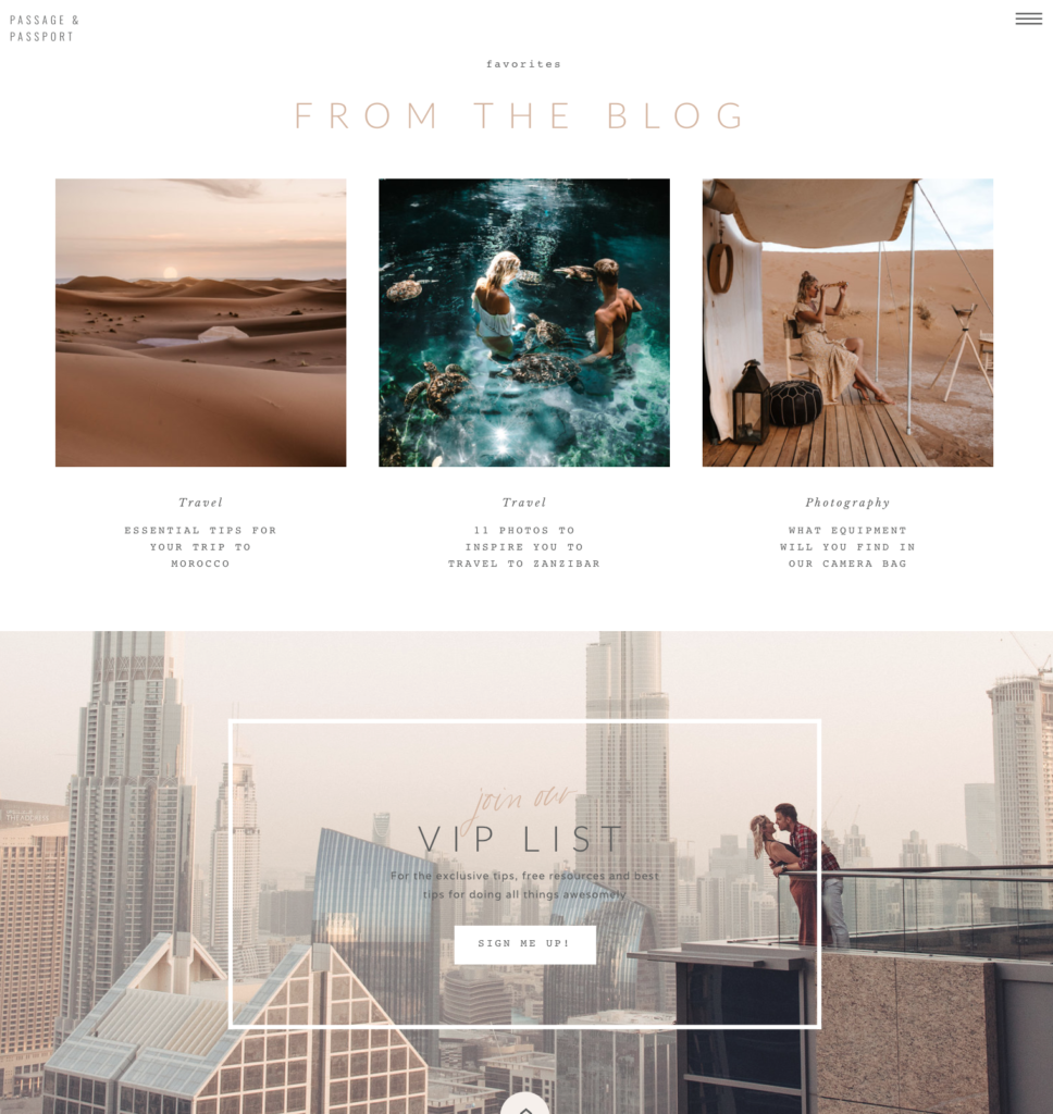
The first thing you’ll see when you land on the HOME PAGE is us welcoming you along with several options from checking our blog, reading more about us or subscribing to our newsletter. There is currently also a notifier about our presets that are coming out next month – get on the list so you don’t miss it! Next up are our favorites blog posts from the Blog. Finally, there is an option to join our VIP list for all the exclusive tips, free resources and doing all things awesomely.
On the very top in the right corner there is a menu bar marked with three lines. As you click on it there will be drop downs so you can browse each section more specifically. You’ll also notice a SHOP PRESETS section in the menu bar which will become live with the launch of the presets, as mentioned earlier.
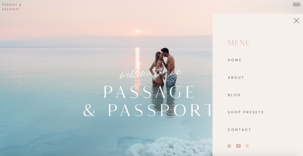
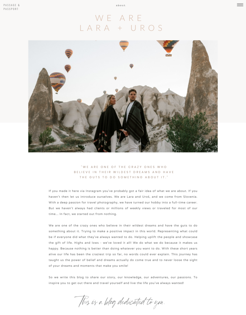
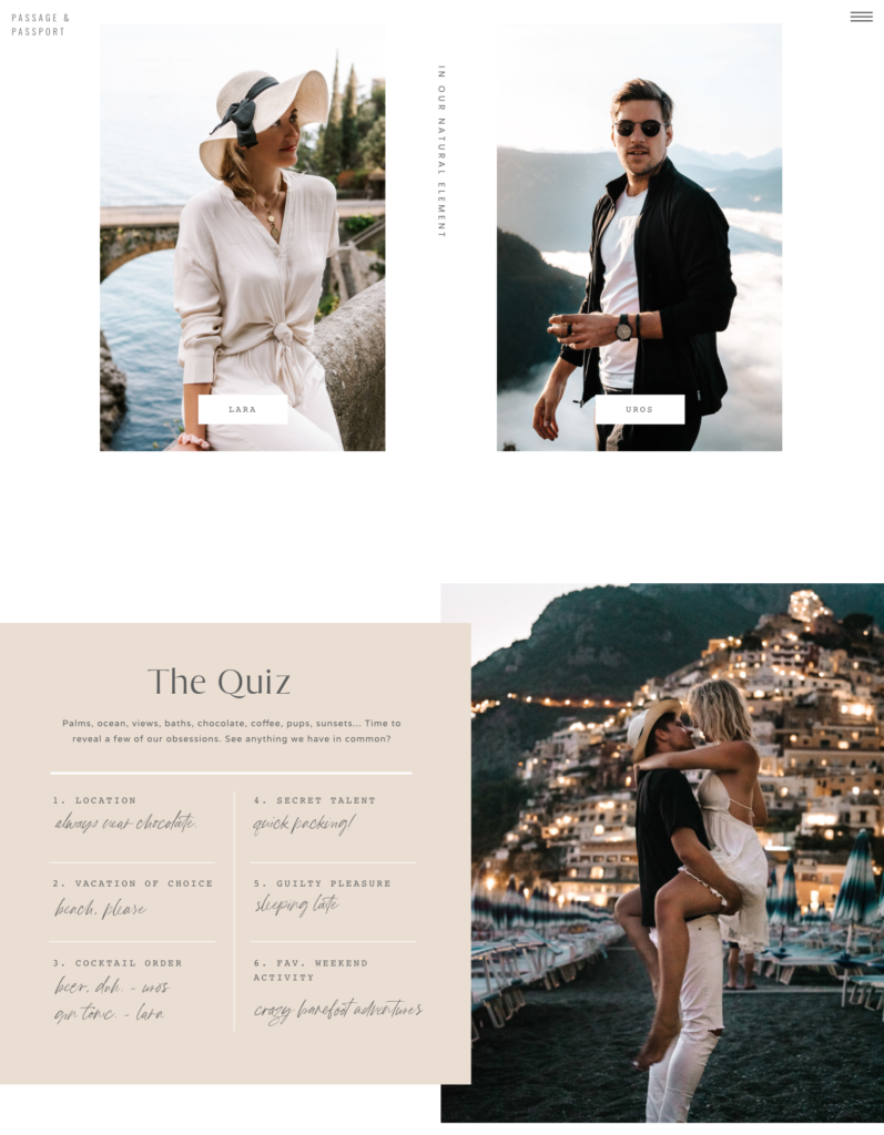
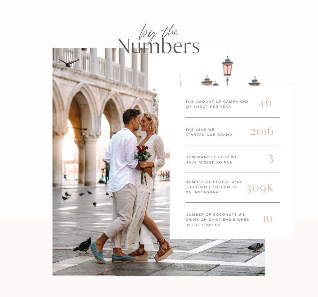
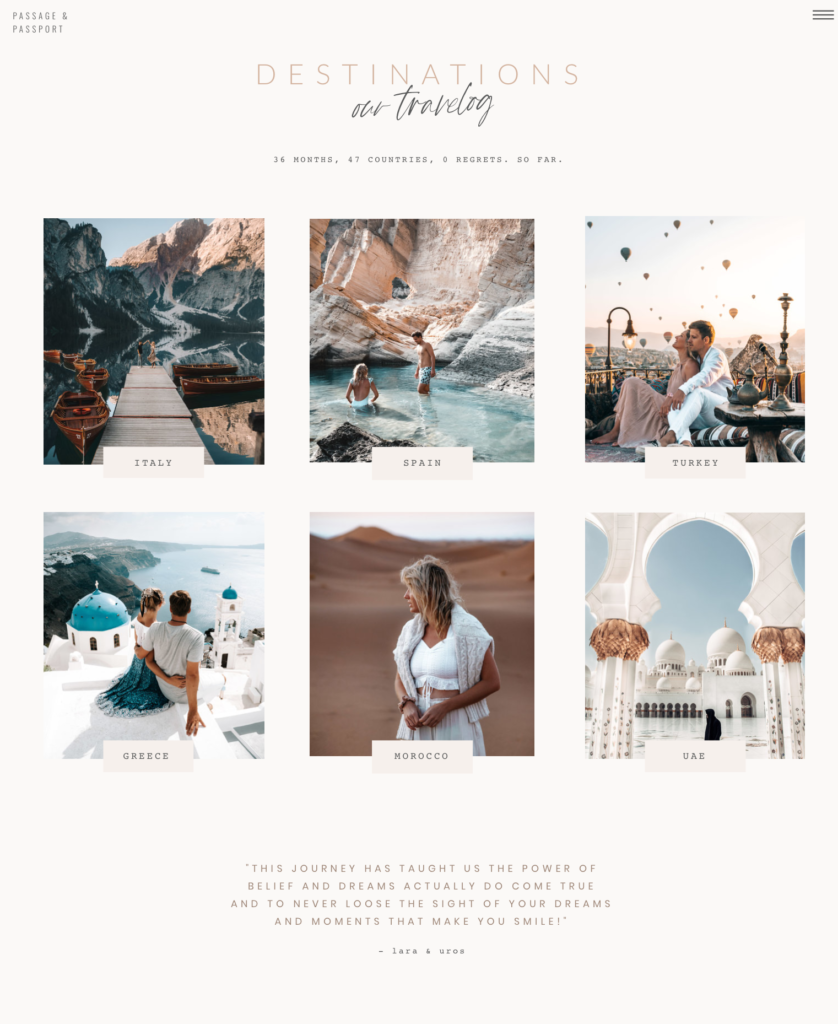
The section ABOUT is probably our favorite. This is where you get to meet us – we write about how we got to this stage of our life, why we’re writing this blog, there’s even a cheeky quiz and some fun numbers to get more insight into our lives. At the end there is a Travelog where you can check some of the most popular destinations we’ve traveled to.
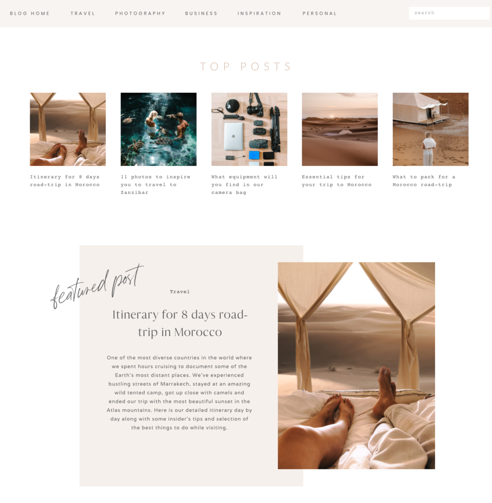
A section where you’ll probably spend most of the time is BLOG. On the very top you can scroll through different categories, such as travel, photography, business, inspiration and personal – if you click one of those options, you will be taken to a page dedicated to that category and able to read all the articles under that topic. We’re working on getting more articles loaded next week, so make sure to check back soon! There is also a search bar on the top right corner for ease of navigation – just pop in your word of interest and voila!
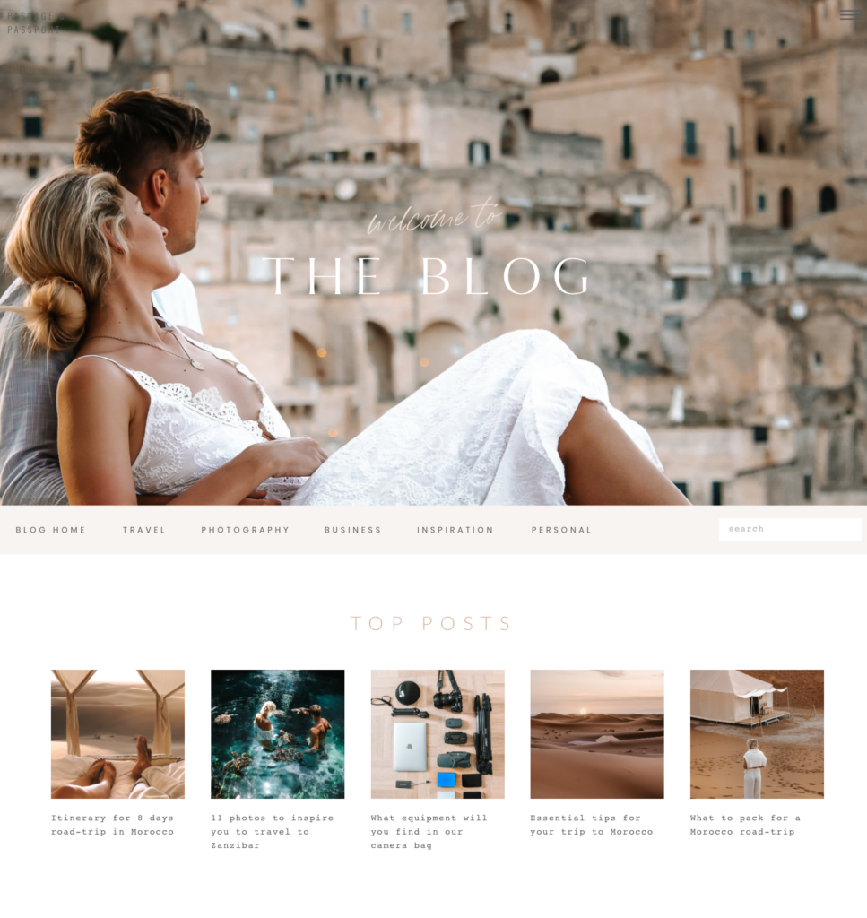
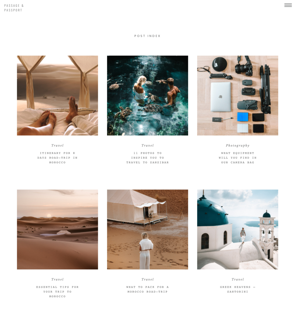
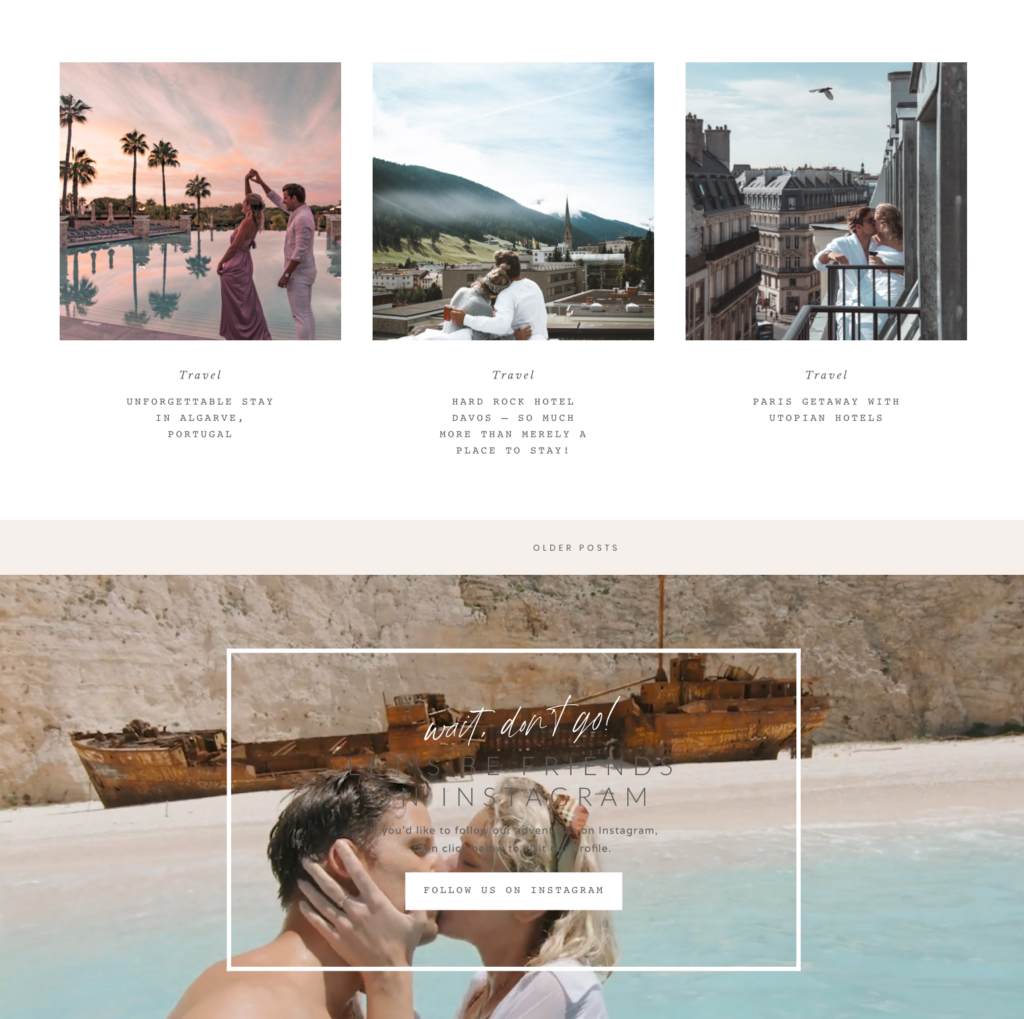
Moving on, in the top you will first see the Top Posts which are our most requested/trending blogs but they are all also sectioned under categories , again for easier navigation. Next up will be our Featured Post along with Post Index where you will see the most recent posts – posts here are sorted by the date and you can scroll back to the oldest posts. This is the place where you’ll see the most recent blogs which will be uploaded weekly – so be sure to check back for updates! We love the next section “Let’s be friends on IG” – here you can easily add us on Instagram with one click. It’s where you’ll find us being active daily on posts and stories.
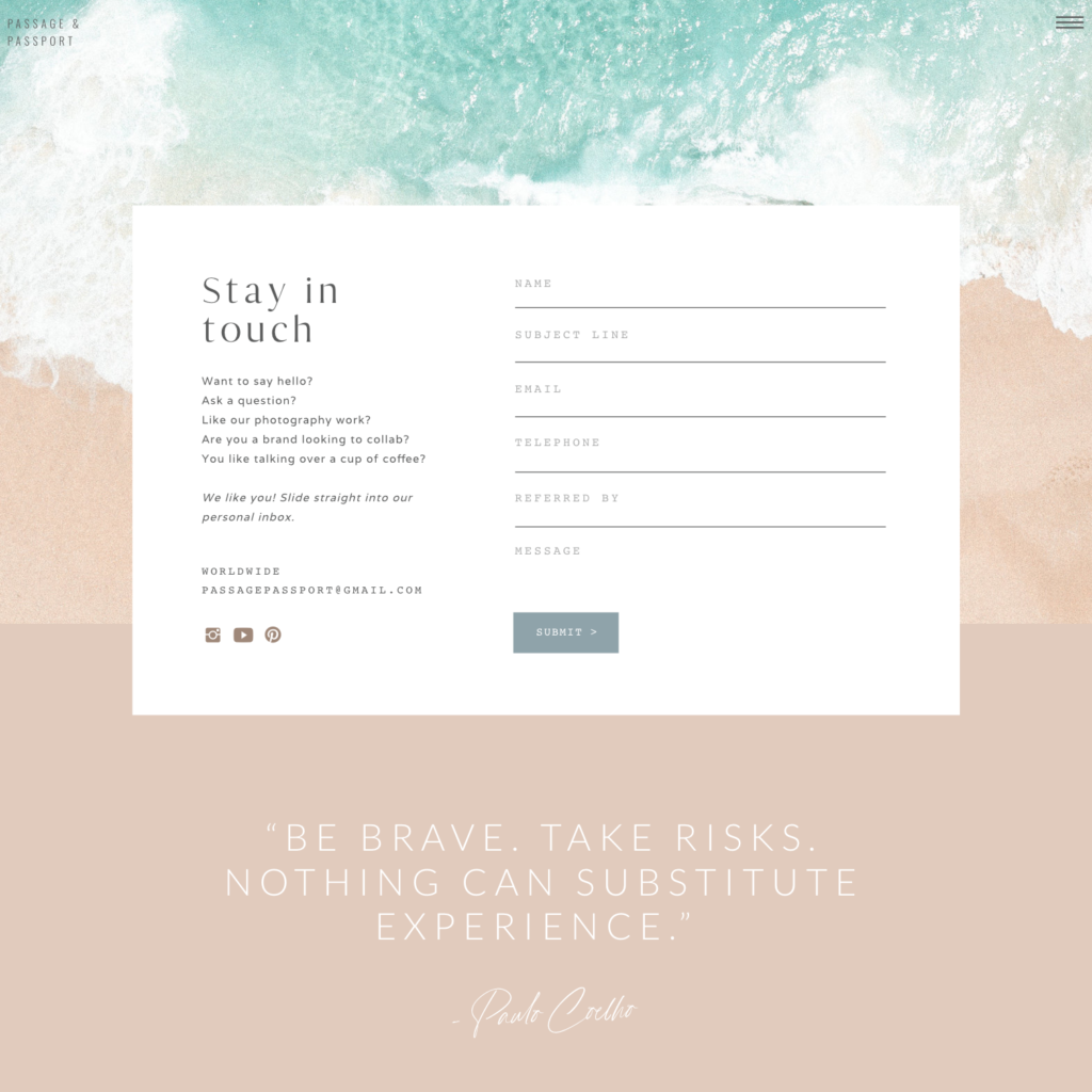
Another section you should take a careful look at is our CONTACT page – here you can reach out to us in case you are interested to chat about any of the blog’s topics, want to give us compliments about our new site, interested in working with us on a campaign or even just say hi. We are always happy to see you in our inbox!
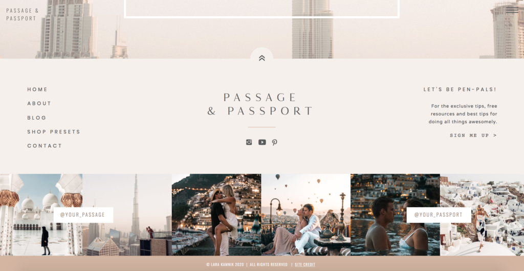
Finally, in the footer, you can see the highlights of our both Instagrams. We also gave a SITE CREDIT here – if you click on it, there is a special discount code waiting for you. Perfect if you’re looking to upgrade your bizz or just dying to have a site with style! Cosmopolitan template is most like ours – we customized it together with Jen and Jeff. On Tonic’s site there are numerous other amazing designs available, too – we swear, they are all incredible and we’ve had a hard time deciding which one to choose. Have a look here.
Here you can also find our social media round-up, you can follow us via Instagram @your_passage & @your_passport, Pinterest, Youtube and Tik Tok @your_passage & @your_passport. If you haven’t already, make sure to sign up for our Newsletter – there will be exclusive emails with presets alerts, giveaways, and more blog content!
We really hope you enjoyed our new site tour; it was designed with you all in mind! And as always, thank you for your constant support and following over the years! We honestly couldn’t do this without you!









The comments +